
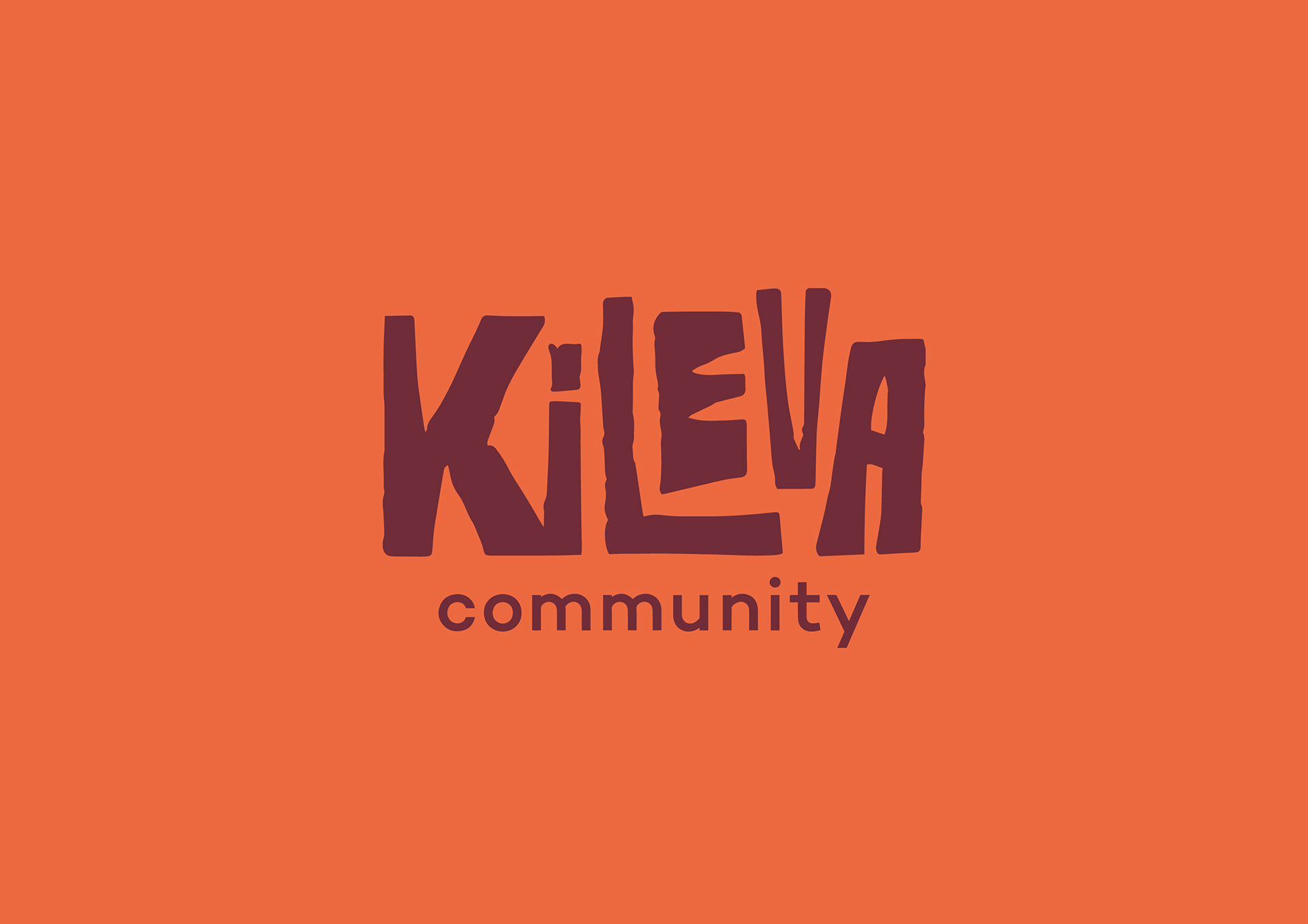
The redesigned logo captured the essence of African culture, using the influence of Paul Peter Piech’s work. It offers a youthful aesthetic which is visually engaging, informal and approachable. The hand crafted look portrays the personal values of Kileva Community.
The Kileva foundation is a small charity providing support and encouragement to the underprivileged community of Sagalla, a remote region near the town of Voi in Southern Kenya. The charity also aims to expand and help other villages in the area. The client was in need of a complete re-brand, as well as a way in which Kileva could market itself and communicate to the intended target audiences, online and through print.
To reinvent the brand the proposal was firstly to change the existing name to Kileva community. Community is at the core of what Kileva does. It reflects a greater feel of family and belonging which reflects the essence of the organisation.
Secondly, a target audience then needed to be created. Kileva Community is focused on building a better future, and one of the methods in doing so is through education. With this in mind it felt as though primary schools were one of the main target audiences. Children are enthusiastic and through stories and visual imagery they can engage and develop an understanding of the charity. The Kileva story can be taken away with the children who can then tell the story to their parents and raise interest. Through the children, the charity can target the parents who are more likely to get involved financially and invest their time into it. Teachers at schools can also get involved in a similar manner to parents.
Kileva is also capable of targeting businesses. There is a potential for the charity to communicate with small companies with similar values and principals on which the Kileva Community is founded upon. We decided to create a promotional package for both businesses and schools. The printed material would include a calendar for businesses and a story book for schools. A thankyou letter would be given to all those who made donations or contributed in any way.
The brief indicated that the brand should exemplify a sense of African and Kenyan culture. Through exploration of Kenyan traditional dress and textiles, patterns were sourced along with an idea of what colours should be used throughout the brand. The patterns were used as a brand element to make the brand consistent throughout all the deliverables, including printed and online. An exploration into hand crafted ways of illustrating was under taken to reflect the brand. Linocuts were a certain focal point, they were bold, stood out and were minimalistic, they were used across all mediums of the brand as well as on merchandise
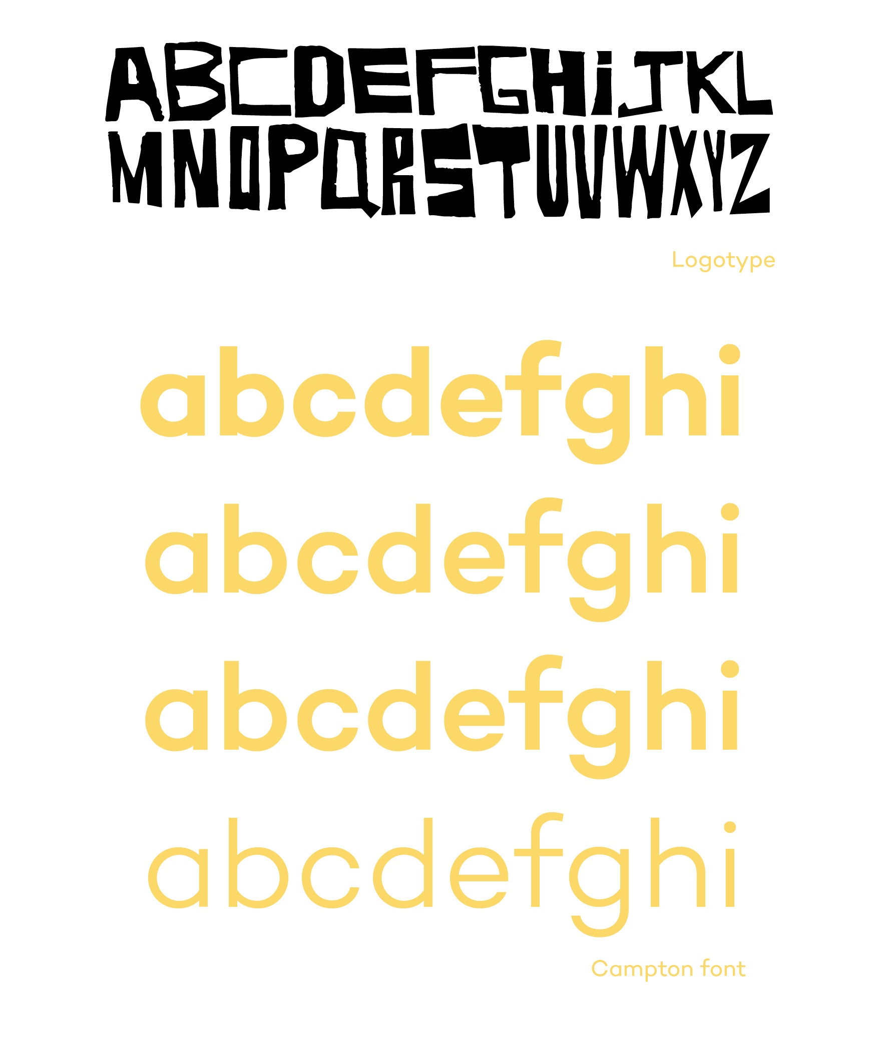
The logotype is inspired by the work of Paul Peter Piech, communicating a raw printed quality which reflects the grass roots character of the Kileva Community. A lower case font is used as part of the brand to bring forth a childlike demeanor, highlighting Kileva community’s focus upon the lives of school children. Campton font is the typeface used for this effect. Campton is friendly and approachable, much like the charity, and has a good variation of weights to show clear organisation of text when needed.
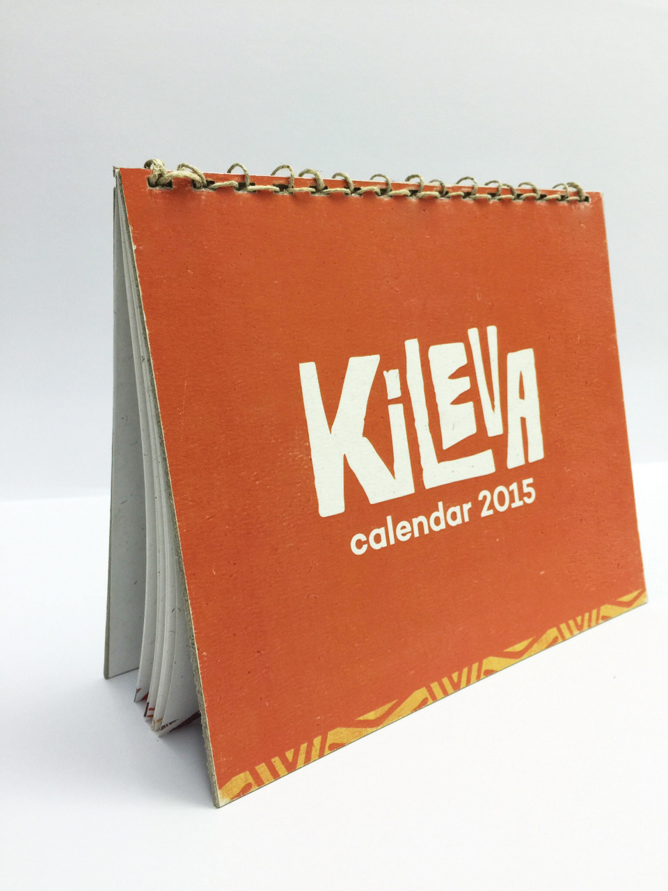
Calendar Front
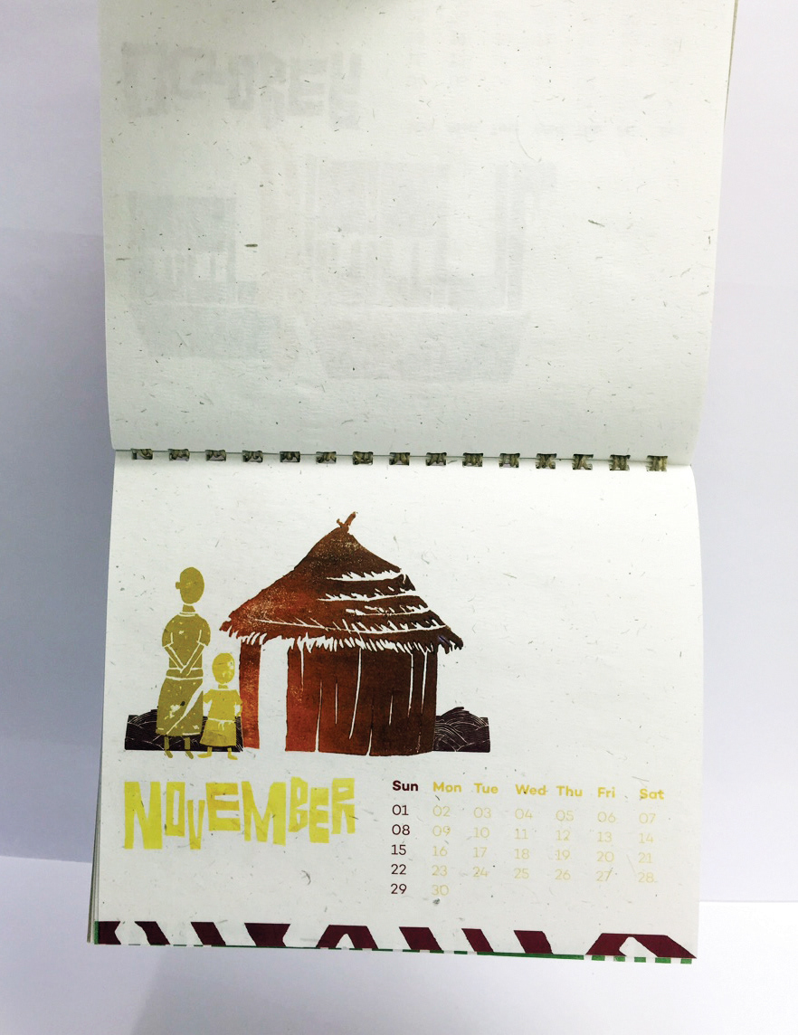
Calendar Inside, featuring our linocuts
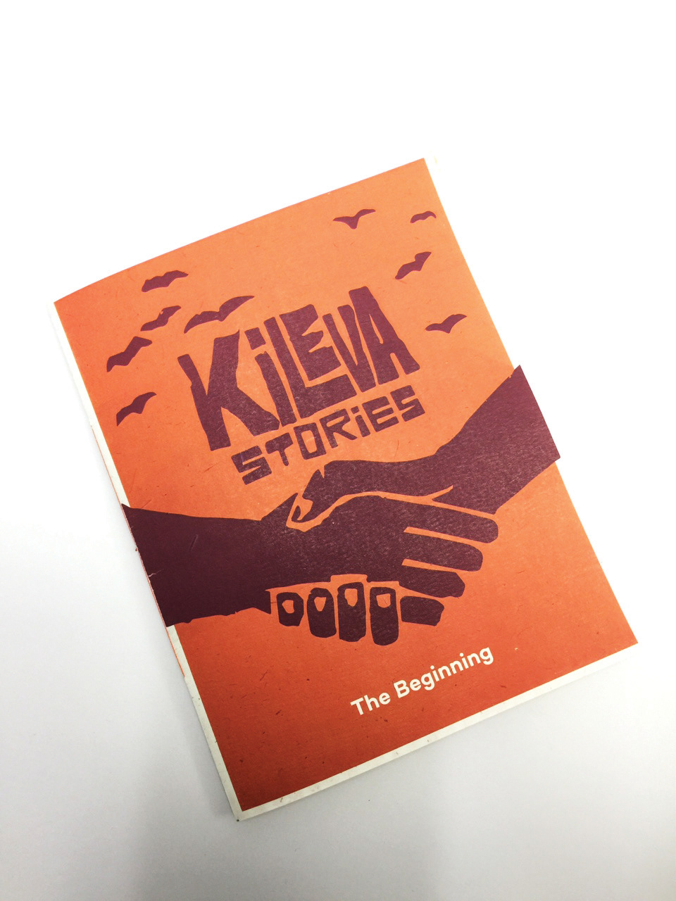
Story Book used for merchandise sale as well as in promotional packaging used for schools

Story book, inside spreads
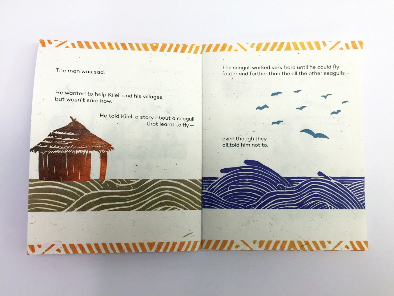
Story book, inside spreads
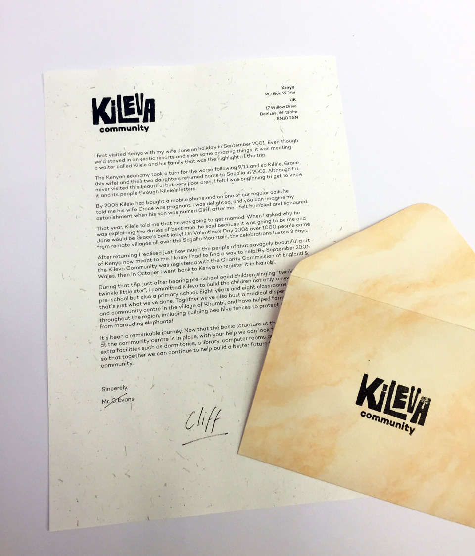
Thank you letter and envelope with Kileva logo
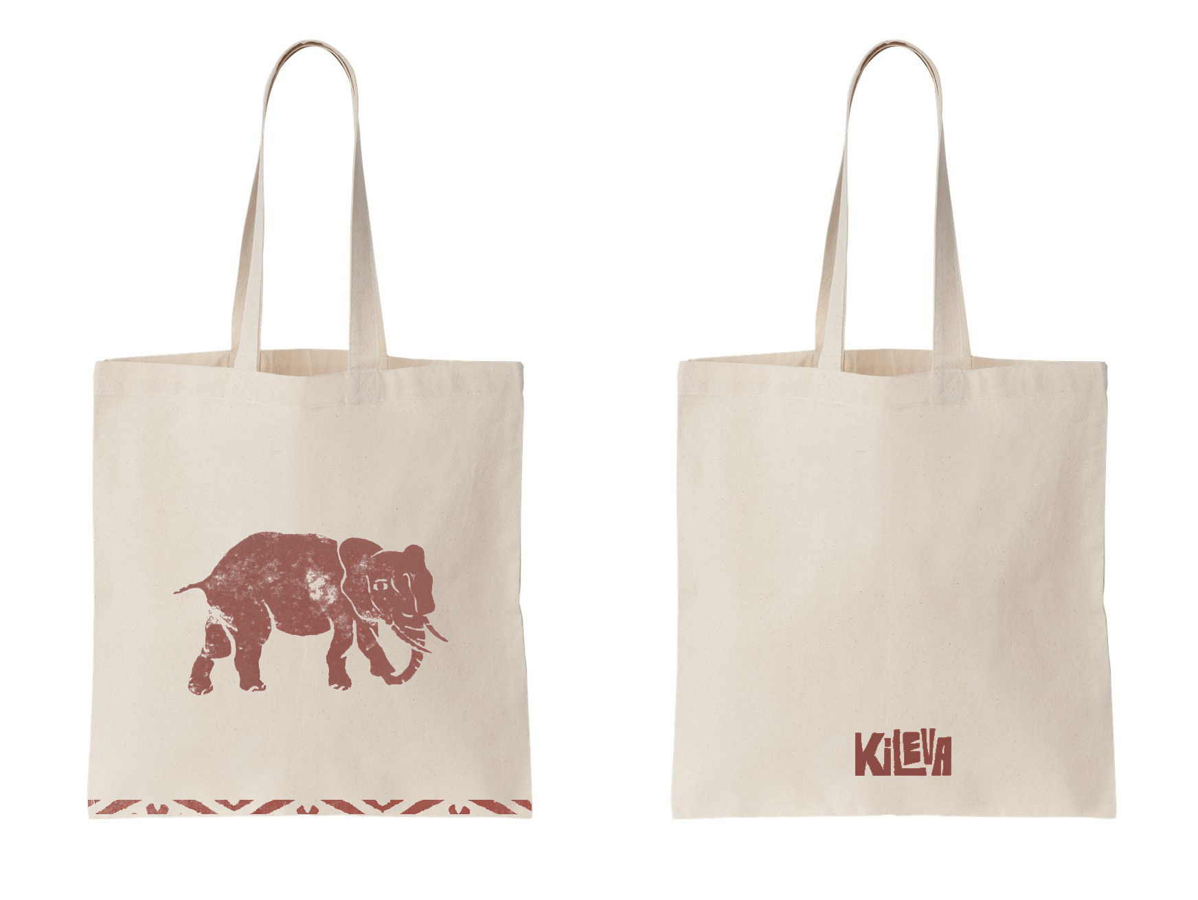
Merchandise using linocuts